(This list is not all-inclusive. It only shows those changes that will impact faculty the most. The date the updates will take place changes from month to month. You can expect the following updates to be in place by the end of the month.)
Activity Feed – Date picker change
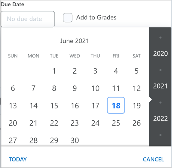
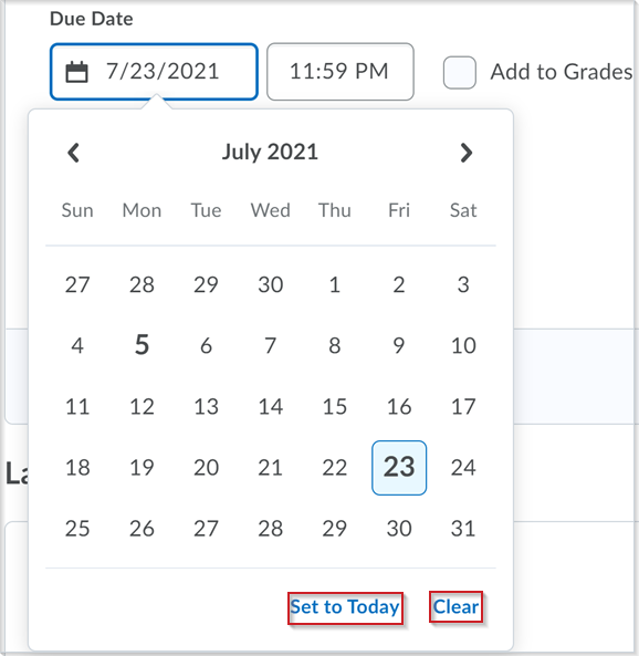
This feature updates the date picker component in Activity Feed. The new date picker has a more streamlined design and requires slight workflow changes: to clear a date/time, use the Clear option and to set the calendar to the current day, use the Set to Today option.
Assignments - Icons in attachments toolbar
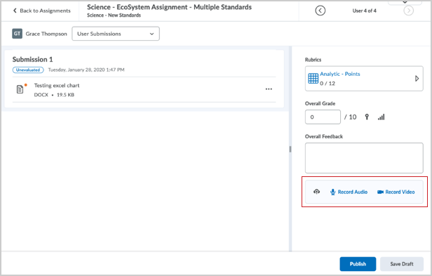
This release updates the attachments toolbar which appears in the evaluation panel on the right side of the new Assignment Evaluation Experience.
Users can now add attachments to their feedback from QuickLinks, web links, Google Drive, and OneDrive using the new icons in the toolbar. Previously, users could only add attachments by uploading a file from their computer, recording an audio note, or recording a video note.
This change aligns the attachments toolbar in the new Assignment Evaluation Experience with the attachments toolbar in the new Create and Edit Assignment Experience.

Assignments - Release Conditions sync with Grades
Assignment release conditions can now be automatically shared with associated grade items in the new assignment creation experience. This ensures that both items follow the same set of rules and become visible/accessible to learners at the same time. This removes the need for instructors to manually recreate the release conditions in two locations and makes all aspects of the assessment experience consistent for the learner.
Only changes made to the release conditions associated to the assignment are transferred to grade items. If changes are made to the release conditions associated to the grade item, those changes are not sent to Assignments. Once an assignment and grade item have their release conditions linked, there is an information message on the Restrictions tab of the grade item, which informs you that release conditions are managed by the associated assignment, with a link to the relevant assignment.
This feature only affects new assignments and edited assignments after the configuration variable is turned on. Existing assignments are not retroactively updated. To update existing assignments, instructors can edit and save individual assignments.
Brightspace Editor – Available as the default editor
This feature updates the Brightspace Editor – Available in ePortfolio External Comments and Quiz Builder | Updated feature released in July 2021/20.21.7. This release sets the new Brightspace Editor as the default editor across Brightspace Learning Environment. As mentioned in the Brightspace Editor – Replaces The HTML Editor | New release note in April 2021, the Brightspace Editor does not have a built in spell checker. Your web browser’s built-in spell check functionality is available in the new Brightspace Editor and D2L recommends using it. The inline limited version of Brightspace Editor is now available in Activity Feed as the default editor.

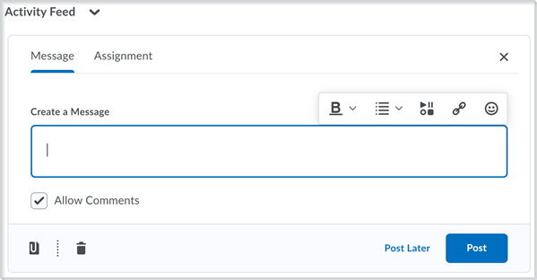
Brightspace Editor HTML options in Activity Feed include: Bold, Italic, Underline, Strike-through, Superscript, Subscript, Font Color, Bulleted Lists, Numbered Lists, Increase/Decrease Indentation, Insert Stuff, Insert Quicklink, and Emoji. Insert Stuff now includes various capabilities, including Video Note functionality.
The Account Settings > HTML Editor Settings option is no longer available as it is not applicable with the new Brightspace Editor. This setting was previously used to make the HTML Editor more accessible to screen readers by removing the RichText presentation layer. Improved accessibility workflows in the new Brightspace Editor make this setting redundant.
Additionally, the Brightspace Editor now remembers the open or closed state of the More Actions button, per user, in order to reduce clicks for users that frequently use options in the expanded editor.
The Brightspace Editor now uses pixels (px) in the font size menu in order to match the Content Settings menu for an org unit’s default font size.
Brightspace Learning Environment – Supported Browsers
As an update to Brightspace Learning Environment – Supported browsers | Updated released in January 2021/20.21.1 and Brightspace Platform – Support alert banner for older browsers | New released in March 2021/20.21.3, the warning banner for legacy Edge has been is removed on Aug 1st and replaced with a “your browser is unsupported” page. with a Your browser is looking a little retro… pop-up message.
D2L recommends using Brightspace Learning Environment with an up-to-date browser that provides robust support for all features. If you are using Brightspace Learning Environment with a legacy browser, a pop-up message appears directing you to update your browser, change to a supported browser, or dismiss the message. If your browser is older than 6 months, the following retro message appears:
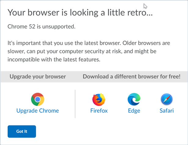
The following message appears if you are using one of the following browsers (or older):
- Chrome 67 (released March 2018)
- macOS Safari 12 (released September 2018)
- Firefox 67 (released May 2019)
- Chrome OS Chrome 67 (released Mar 2018)
- iOS Safari 11 (released September 2017)
- Android Chrome 67 (released Mar 2018)
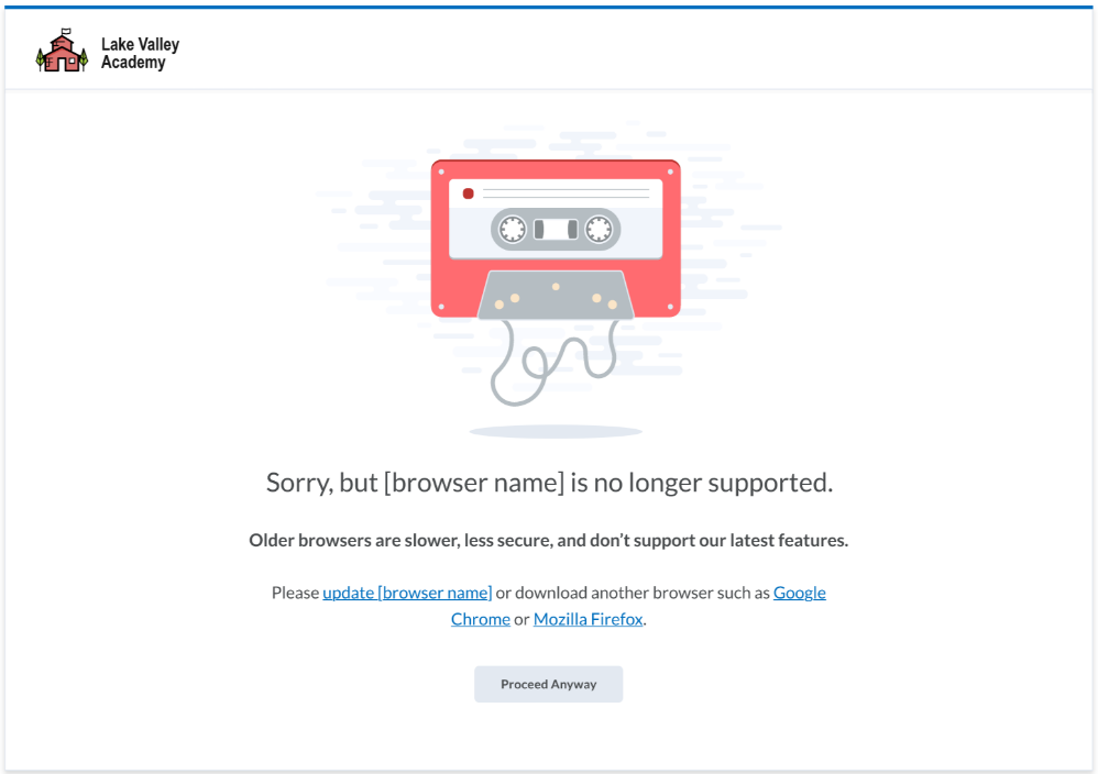
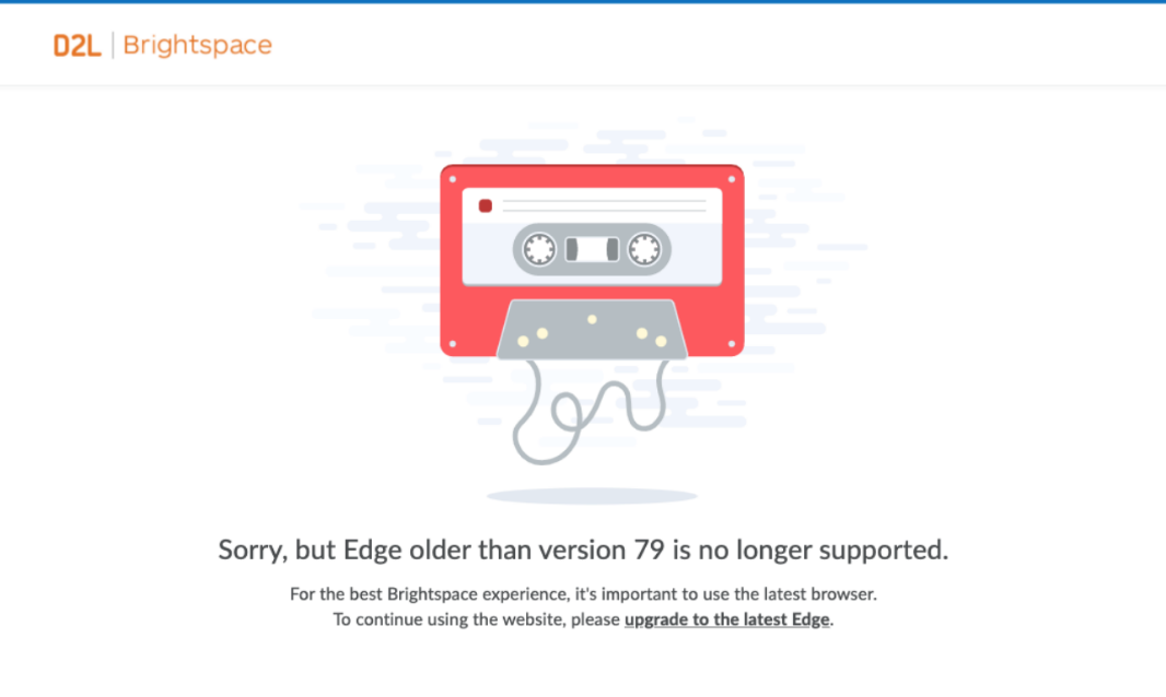
If you are using Legacy Edge (older than version 79) or Microsoft Internet Explorer 11, the following message appears:
Legacy Edge (Microsoft Edge versions <79) is now blocked from accessing Brightspace
Cannot proceed at all.
Brightspace Learning Environment – End of Life for Secondary Window Pop-Ups
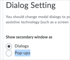
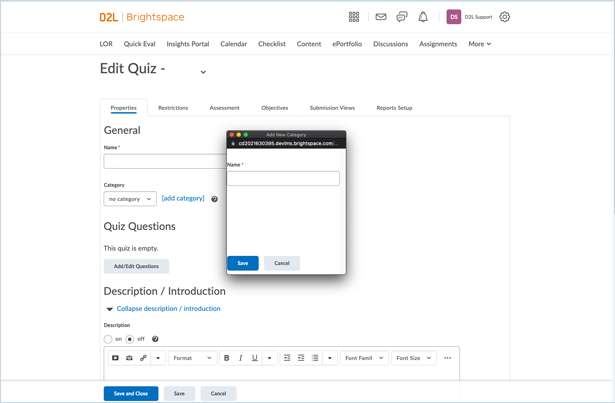
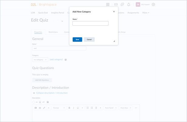
This update brings End of Life status to the Show dialogs as pop-ups setting under User Profile > Account Settings. All secondary windows now open in Dialogs. Historically, this setting was used as an Accessibility accommodation as not all Screen Readers were able to handle dialogs. Modern screen readers provide better support for dialogs.
Brightspace Pulse – Comment on Activity Feed posts
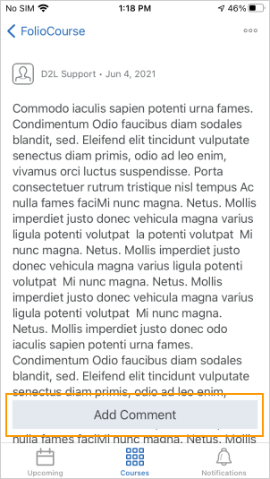
To encourage class engagement, learners can now comment on Activity Feed posts in Brightspace Pulse. Previously, learners could only read Activity Feed posts and comments in Brightspace Pulse.
In Brightspace Pulse, tap the Courses tab, and then tap a course with Activity Feed enabled.
From the Activity Feed tab, tap the post you want to comment on, and then tap Add Comment. A browser opens, displaying the Activity Feed for the course in Brightspace Learning Environment.
Tap the post you want to comment on, add your comment, and then tap Post. Your comment displays.
To close the browser and return to Brightspace Pulse, tap Done.
In Brightspace Pulse, refresh the page to display your comment.
Brightspace Pulse – View all grades for a course
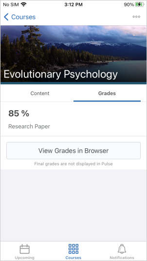
Learners can now view all grades for a course from a new Grades tab in the course. Previously, learners could only view course grades from notifications in Brightspace Pulse or by opening a browser and navigating to the Grades tool in Brightspace Learning Environment.
To view all grades for a course, tap the Courses tab. Next, tap a course, and then the Grades tab. All received grades for the course display, indicating if feedback is available. To open the Grades tool in a browser and view full grade breakdowns and calculations, tap View Grades in Browser.
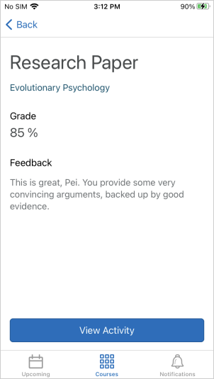
To view feedback, tap a grade. The grade and text feedback display. To view details about the associated activity in Brightspace Learning Environment, tap View Activity.
Brightspace Pulse – View content module descriptions
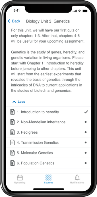
Learners can now view content module descriptions in Brightspace Pulse. Instructors use module descriptions to communicate vital information to learners about specific course content. Previously, module descriptions were only visible from Brightspace Learning Environment, which may have caused learners to miss important information when accessing courses from Brightspace Pulse.
Discussions - Consistent evaluation experience
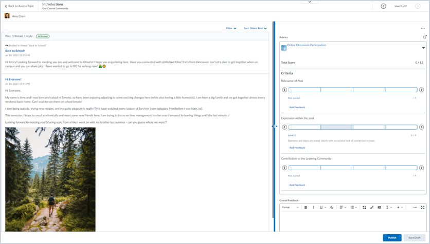
This feature updates the user evaluation experience when assessing a topic or an individual learner, allowing instructors to better review and evaluate discussion contributions. The evaluation interface for Discussions has a similar layout as the Assignments - Consistent evaluation experience.
This new experience involves a new page layout, with evaluation tools and the post being evaluated displaying side-by-side. Assessment workflows have not changed.
For more detail about the improvements in this new experience, visit the Welcome to Our New Discussion Evaluation Experience post on Brightspace Community.
For additional information on the consistent evaluation experience across all Brightspace tools, visit the What is Coming in Evaluation: 20.20.12 post on Brightspace Community.
Discussions – Improvements to visibility and posting restrictions
There is a new workflow that makes it easier for instructors to set visibility and posting restrictions for discussion forums and topics. More specifically, this change simplifies date management for discussion activities, offering a more consistent, simplified, and consolidated experience for instructors. For more information on these changes, see the Changes To Availability And Locking Dates For A Consolidated Dates Workflow blog post.
The following changes are visible to instructors when creating or editing discussion forums and topics:
Note: These changes also affect the Classic Content and Manage Dates tools.
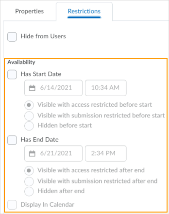
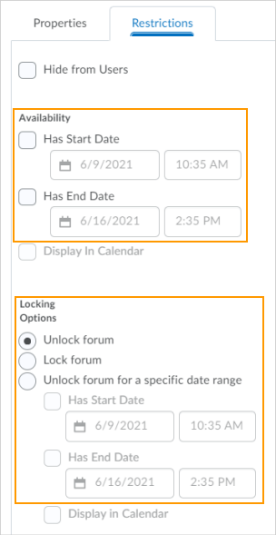
- From the Restrictions tab, the previous Locking Options are now consolidated with the Availability Start Date and End Date options and display as the following new options:
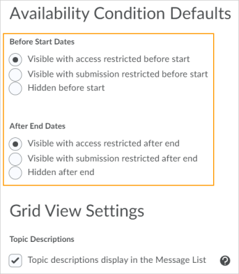
- Visible with access restricted before/after start/end. The topic/forum is visible to learners before/after the start/end date, but they cannot access it. Previously, Classic Content was the only tool to make discussions visible without access.
- Visible with submission restricted before/after start/end. The topic/forum is visible to learners before/after the start/end date and they can access it, but they cannot post new threads or replies. This effectively makes a discussion read-only. Previously, this was accomplished with the lock option or unlock dates.
- Hidden before/after start/end. The topic/forum is hidden from learners until the start/end date. This is a new feature. Calendar events for Availability Starts and Availability Ends are hidden until the start/end date. Notifications are also not sent until the start/end date. Previously, the hidden status of a discussion topic was decided by the tool displaying the topic.
- From the Restrictions tab, the Display in Calendar option is now consolidated with the Availability Start Date and End Date options, which adds the start date and end dates to the calendar. Previously, the tool decided which calendar event should be added to the calendar. With this change, calendar events for availability dates may change and additional events for Availability Start Dates may be added.
- Calendar events for unlocked dates are now hidden from learners.
- Where Discussions and User Progress may have previously hidden a topic or forum when outside of availability dates, those tools now may show them as visible, but inaccessible.
- From Discussion Settings, instructors can now set the default visibility and access behavior for new discussion forums and topics. The defaults can be set at an organization level.
Rubrics – Increased accessibility with labels on radio buttons
To provide a better experience to clients using screen readers, criterion levels now indicate the level name and point value of each radio button when it has the focus. Previously, screen readers only indicated “radio button X out of Y” or “radio button, not selected” depending on whether the focus is on a selected criterion.
In addition, the mobile view of Rubrics now has radio buttons implemented to describe the level name and point value of each criterion level, consistent with the view on a larger screen.
Note: Depending on the screen reader you use, the way of listing all the radio buttons on a page differs. For example, In NVDA, press INSERT+F7; in JAWS, press CTRL+INSERT+A. In general, D2L tests compatibility with the following screen readers: NVDA, JAWS, and Voiceover.
Rubrics – Inline grading improvements
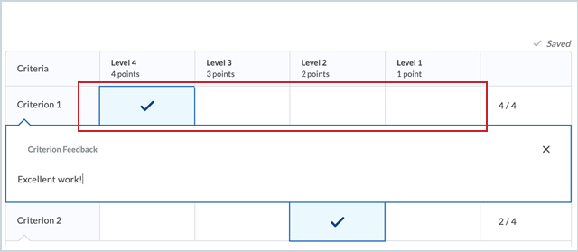
There have been improvements to the ease of use of the inline grading experience, including changes to ensure grading experience parity for screen reader users. Previously, screen reader users were unable to grade or review tasks due to missing information. In addition, the updates now include the following:
- The interaction of the arrow buttons at either end of the evaluation slider now indicate a hover state compared to a focus state. If there is no level under the hover pointer, the level area is empty.
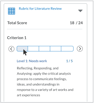
If the hover pointer is on a level, the name, description, and score appear in the level information area below the slider. - Keyboard navigation of the slider evaluation levels identify the focus and indicate the criterion you are viewing. When the keyboard focus is on a level, you can press the arrow keys at the beginning and end of the slider or use the left and right arrow keys on the keyboard to move the focus within a scale. In grading mode, moving the focus to a level directly selects the level. You can also press Enter to select or unselect a level. In preview mode, the selected level does not change when you review other levels’ information.

Caption - Keyboard navigation of the slider evaluation levels more clearly identify the focus and level you have selected in grading mode. You can use the right or left arrow key at the beginning and end of the slider to move the focus within a scale. Press Enter or use the left and right arrow keys on the keyboard to select and deselect the level.

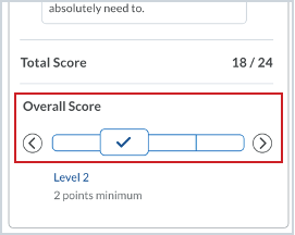
When the level is selected, a larger box outlines the slider level, and a checkmark appears in the level - The level name and description of an evaluation level appear below the evaluation slider in the selected state, and the selection indicator appears on the slider at the chosen level.
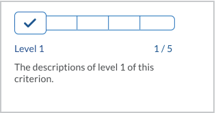
When a level is selected, the level name and description appear, along with the selection indicator - When the rubric has been graded, the level information area displays the selected level’s information by default, unless other levels are in hover state in grading mode, or in hover or focus state in reviewing mode.
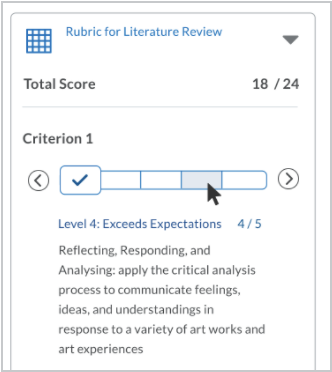
When a non-selected level is in hover state, the name, description, and score appear in the level information area below the slider. - When you move the selection block to a different level, there is now an animation to smoothly transition to the new level.
Rubrics – Brightspace Editor Additional Functionality
This feature updates the Brightspace Editor – Additional Functionality | Updated released in June 2021/20.21.6 and updated in Brightspace Editor – Available in ePortfolio External Comments and Quiz Builder | Updated released in July 2021/20.21.7. This update includes the following:
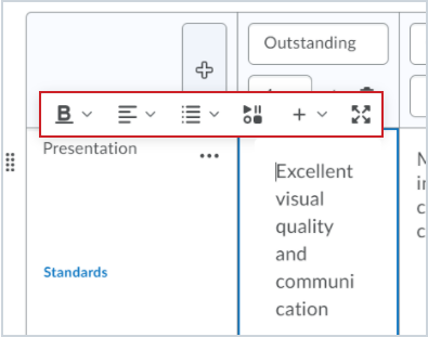
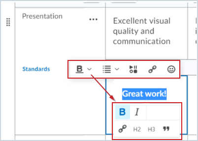
- The Brightspace Editor toolbar now appears in the rubrics creation and edit experience in description and feedback fields.
- The Insert Stuff and Insert Quicklink buttons now appear in the different views with additional formatting options.
Rubrics - Overall Score now appears in Mobile view and the New Assignment Evaluation Experience
When an instructor using the New Assignment Evaluation Experience opens a rubric in a new window, the Overall Score displays for each rubric, and the instructor can override the level if necessary. Previously, if an instructor did not open a new window, rather, they viewed the rubrics inline in the New Assignment Evaluation Experience tool, the Overall Score did not appear, and the instructor could not override the level. As a result, text-only rubrics could not be assessed because the Overall Score was not available.
Now, instructors using the New Assignment Evaluation Experience or the Mobile view can evaluate text-only rubrics for Assignments and Discussions as expected.
